Responsive Web Design Services for Brokerages
Customer retention and customer acquisition are two main goals of any insurance business. It’s no surprise, as keeping your most loyal customers and adding new ones strengthens customer relationships, reduces marketing costs, boosts referrals and of course, increases your bottom line.
Having a nice-looking, optimized insurance agency’s website is only half the battle; it gets your prospects in the door but will only keep them engaged for so long. In the competitive insurance space, learning how to keep prospects on your site long enough to buy your products and services but not too long so that they get lost in messy navigation— is part of responsive web design services for Insurance Agents.
About Trufla:
Trufla Technology is an insurtech that focuses on helping brokers and agencies leverage the power of digital to solve insurance problems. Our product suite includes lead management, custom raters, mobile apps, Insurance SEO Services, website design, Insurance Website Redesign: Relaunch & Revamp, digital scorecards, and more. Recognized as one of the prominent insurance technology companies in Alberta, contributing to the growth of IT and software companies in Canada. We take pride in being among the top IT companies in Calgary and prominent software companies in Canada.
What are Responsive Web Design Services?
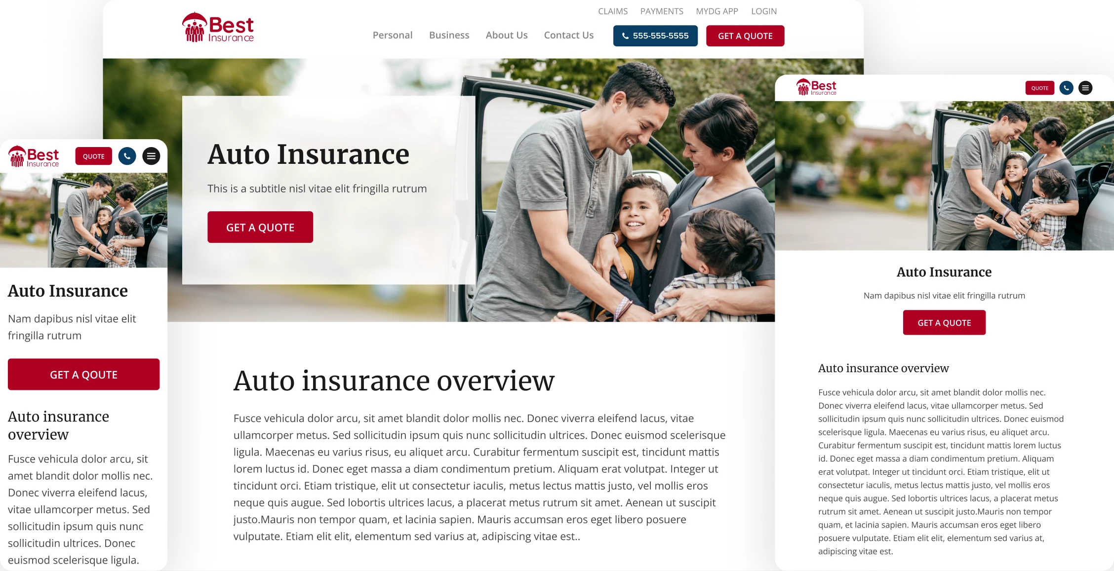
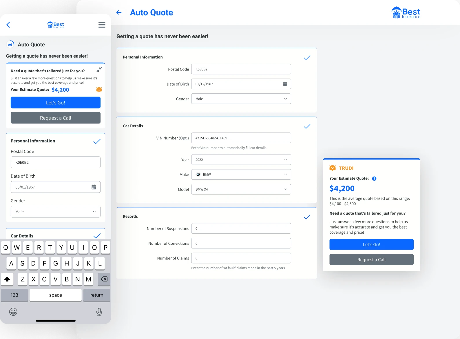
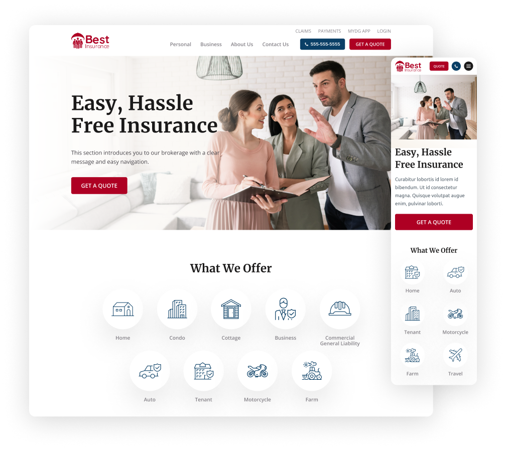
Responsive design is a web design approach that keeps website design consistent across all devices that people use, focusing on a single design and codebase. Used for Web-based apps and website designs, responsive design Services for an insurance website create a seamless design from one device to another.
A typical example is when a potential customer lands on your website searching for personal insurance. They use their smartphone to start searching online but run out of time and continue their search on their desktop computers hours later.
If your website is not designed with the consumer in mind and the devices they’re using, your potential buyer will have to start their insurance search from scratch. Where the prospect left off on their smartphone is not where they pick up on their laptop. This scenario leads to a high bounce rate and more business for your competitors, which is a nightmare for all insurance agents.
Responsive Web Design Glossary:
- Fluid Grid: A layout system that uses percentages instead of pixels so the design scales across different screen sizes.
- Media Query: A CSS technique to apply styles based on device or viewport characteristics like width, height, orientation, and resolution.
- Breakpoint: Specific points in a responsive design where the layout changes for different screen sizes and resolutions. These are set with media queries.
- Viewport: The visible area of a web page on a device. Meta tags can be used to control the viewport size and scale on mobile devices.
- Flexbox: A CSS layout module that makes it easier to design flexible and efficient layout structures, especially for responsive design by distributing space within a container.
- CSS Grid Layout: A powerful layout system in CSS that creates complex, responsive grid-based layouts by dividing the page into major regions or defining the relationship in terms of size, position, and layer between parts of a control built from HTML primitives.
- Responsive Images: Techniques to ensure images scale and load the correct size for the device. This often involves using the srcset attribute in HTML and CSS properties like max-width: 100%.
- Mobile-First Design: Design the mobile version of the site first, then scale up for larger screens. This way the site works well on mobile devices before adapting to tablets and desktops.
- Hamburger Menu: A navigation element that collapses the menu into a compact form, usually three horizontal lines, so it’s accessible on smaller screens.
What Are the Basic Elements Required for a Responsive Web Design?
Web designers include these basic three elements in all their responsive web design work:
Flexible Layouts Using Fluid Grids:
Flexible layouts use relative units, like percentages, instead of fixed units, like pixels, to define the width and height of elements. Using these layouts is essential in responsive web design. This method allows the layout to adapt dynamically to different devices and screen sizes.
CSS Grid and Flexbox are two modern CSS techniques that facilitate using these flexible grids. They make it easier to adjust the layout based on the screen size and resolution.
Responsive Images and Media
Images and other media should be scalable to fit different screen sizes without losing quality or causing layout issues. To achieve that, the designers set the max-width property of images to 100%. Another technique involves using the ‘srcset’ attribute to provide different versions of images for different screen sizes. Using these methods ensure the images resize fluidly and are optimized for different devices.
CSS Media Queries
Media queries are a cornerstone of responsive web design. They allow the designer to apply different CSS styles depending on the device’s or view port’s characteristics. That applies to height, width, and orientation. Defining breakpoints ensures the design adapts smoothly across various devices, from mobile phones to tablets and larger desktop screens. By adjusting layout, typography, and other stylistic elements, media queries enhance usability and aesthetics on all devices.
What are the benefits of using responsive website development Services for insurance brokers and agents?
There are many benefits of using responsive web design Services, including:
Improved user experience:
A website is easier to navigate and use on all devices, which means that visitors are more likely to stay on your website and find the information they need. This is especially important for businesses that sell complex products or services or have a lot of content on their website, like an insurance brokerage or agency. Responsive web development services ensure a seamless user experience across all devices.
Increased traffic
More people are using mobile devices to access the internet. In fact, mobile devices now account for most of all web traffic. That’s why a responsive design that is mobile-friendly is one of the must-have elements of any website.
Better search engine optimization performance
Having a responsive design is one of the SEO best practices. Google and other search engines favour websites that incorporate responsive design in their search results, allowing your website to be ranked higher in search results.
Lower bounce rate
Bounce rate is the percentage of visitors who leave a website after viewing only one page. Responsive-designed websites typically have lower bounce rates than non-responsive websites because visitors are more likely to stay on a website that is easy to use and navigate. With a responsive design, you’re less likely to lose potential customers.
Increased conversions
A website that uses responsive or adaptive design can help to increase conversions, lead generation and sales. It also leads to improved user engagement. This is because visitors are more likely to complete a task on a website that is easy to use and navigate.
Stronger brand image
A well-designed website can help businesses create a strong and professional brand image.
Insurance agency websites that include responsive design elements can make it easier for customers to contact businesses and get the information they need.
Readmore:
Responsive Website Design Services
How do Responsive Website Design Services Help Drive a Brokerage’s Sales?
A well-designed website makes it easier to navigate and use on all devices, which means that visitors are more likely to stay on your website and find the information they need.
An insurance website created with responsive design in mind can lead your insurance agency’s website to rank higher in search results, which can help you attract new clients.
Overall, responsive web design is an essential element of modern web design for insurance brokers. By investing in efficient and compatible cross-device insurance site design for your insurance brokerage, you can improve the user experience for your visitors, attract new clients, and grow your business.
At Trufla, we help insurance agencies advance their business by creating the best insurance website design. Book a demo now to get responsive web design services.
Our Responsive Website Design Services: Seamless Customer Experience
As a brokerage, it’s important to provide a seamless customer experience. Often, a busy prospect finds another website (your competitor) that is easier to use – one that can direct them to a CTA button or the quote form that leads them to buy insurance. The importance of the customer’s experience on your website cannot be underestimated. A responsive website allows you to provide your website visitors with what they came for – a smooth, easy experience of buying insurance – instead of a frustrated consumer who leaves your website, contributing to your high drop-off rate.
A Buyer’s Behaviour Drives the Sale
Did you know most of your insurance customers will purchase home or car insurance from their desktop computer after researching on their smartphone? The Adobe Digital Index retail report (Source: Smart Insights) puts the desktop retail conversion rate at 3.7% to 4%, and the mobile one at 1.25% to 1.34%.
At Trufla, we help brokerages deliver a top-notch user experience to their customers, where the same feel and structure of a website is apparent across different devices (smartphones, laptops, e-readers, etc.), to engage the site visitor into an uninterrupted transaction.
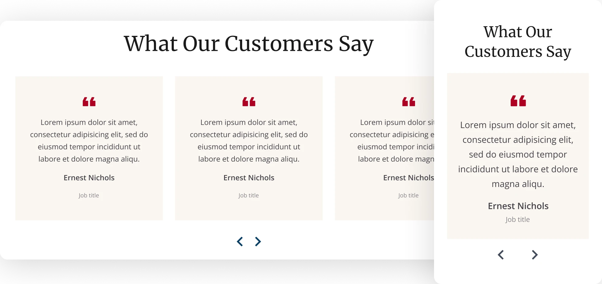
With a responsive design, your customers can easily navigate the important elements of the website, such as the customer testimonials section, and FAQs.
Without a seamless User experience, visitors on your site are more likely to abandon their actions, whether that’s abandoning a quote form or leaving your website altogether. You don’t want to lose your target audience because of a bad website design.
Key Areas Where We Focus on Responsive Design Projects
There are several key areas to focus on when it comes to creating a functional website that incorporates responsive design or adaptive layout design, including the following elements:
Navigation: Creating functional navigation for your website guides your visitors to find the information they’re looking for, whether that’s a quote form or details on home insurance.
Images/icons: Placing images and icons in the correct locations on your site improves functionality and ease of use for prospective or current clients.
Buttons: If your web visitors don’t know what to do next on your site, they will quickly leave. Adding CTA buttons in the right places improves your site engagement and improves the drop-off rate.
Stacking (desktop layout): Images and content must be moved around to fit a smaller sized area (e.g., browser). Stacking improves the user experience from one device to another without losing the customer from purchasing a product or filing a claim.
Tasks: Our Responsive Website design service helps you complete a task. E.g., browsing on your phone to buy insurance (then going back to your desktop browser to continue the purchase). What’s the easiest way for customers to make that purchase? You must design with efficient tasks and goals in mind, which requires research from the brokerage or insurer.
Responsive Website Design Services
Responsive Website design VS Adaptive Design?
Adaptive design is a web design approach that uses multiple fixed layout sizes, allowing for more insurance website display flexibility and control over your screen sizes compared to responsive design. Often, designers will take a hybrid approach to designing a website using a combination of adaptive layouts and responsive design for insurance websites.
TruWeb Tools: Reshaping the Customer Experience
With truWeb, you can completely transform your website into a functional digital sales platform that is designed by responsive web design experts that make sure your website helps you achieve your business goals.
Trufla specializes in building functional tools that revolutionize the way insurance brokerages operate. With truWeb, you don’t just get a great-looking new website, you ensure your website’s functionality gives you maximum benefits by focusing on important aspects, including:
- Responsive Website design services
- Graphic design
- Search engine optimization (SEO)
- Conversion optimization
- Digital Analytics
- Automation
- Cross-platform adaptability
- Insurance Technical SEO
And more
Getting Started with truWeb
Ready to take the first step towards transforming your website into one of the best insurance websites? truWeb efficiently alters your digital sales platform across all your customers’ devices. We’ll show you the capabilities of truWeb and how it can completely improve your brokerage’s digital presence. Request a demo today!
Readmore:
Why Should Trufla Be Your Responsive Web Design Company of Choice?
Hiring Trufla for your responsive web design needs has many benefits, especially for insurance brokers and agencies:
- Specialized Knowledge: Trufla focuses on the insurance industry so your website is designed to meet the unique needs and challenges of insurance brokers. This means a user-friendly experience for both potential and current clients.
- Better User Experience (UX): Trufla creates websites that are not only beautiful but also usable. We use best practices in our website UX design services, like fast loading times, easy navigation and clear calls-to-action to improve user engagement and conversion rates.
- Mobile Friendly: With responsive design, Trufla ensures your website works on all devices from desktops to smartphones. More users are accessing websites from mobile devices and a mobile-friendly design helps retain visitors and reduce bounce rates.
- Custom Solutions: Trufla offers custom web development solutions including insurance calculators, interactive maps, online chat services and personalized quotes. These features help the user by providing relevant and useful tools on your website.
- SEO and Digital Marketing: Trufla provides integrated SEO services to get your website visible on search engines and drive more organic traffic to your site. We also offer digital advertising solutions to reach a wider audience faster.
- Efficiency and Automation: By developing custom software and applications, we can help streamline your workflows and automate time-consuming tasks. This means your team can focus on more strategic tasks like lead generation and customer service.
- Website Security Services: Customers are more likely to do business with you if they trust your brokerage to protect their data. If your website is hacked, it could damage your business reputation and lead to losing customers and revenue.
- Ongoing Improvement: Trufla believes in ongoing testing and optimization. We carry out user testing and make adjustments to ensure your website stays effective and user-friendly over time.
Discuss your responsive design project with a dedicated project manager now! Book a demo!
FAQs: Responsive Website Design Services for Insurance Websites
Adaptive design is a design philosophy that creates fixed multiple-page layouts and chooses a design layout based on the browser size. Responsive design works with only one single-use design that adjusts to any screen size. Responsive design is focused on the device while adaptive design also takes the users’ context in mind. Responsive design, while generally less expensive than adaptive design, ultimately gives designers less control over the design of each device. The best approach for your brokerage will depend on its specific needs and requirements.
One major advantage of using adaptive design is it is a custom-made solution that matches the screen specifications of a user.
Developing a Mobile-friendly insurance web design is not the same as creating a responsive design for your website. Developing and designing a mobile-friendly website involves designing for a mobile device that has smaller screen sizes. Mobile-ready is another related term. So, a mobile-friendly web design works perfectly on a mobile site.
A mobile-first approach and using responsive design for an insurance website are two different approaches. A mobile-first approach focuses on designing and developing a website or application for mobile devices. A mobile version of a site will always be created first with this approach. A responsive design is creating a single design that applies to various screen sizes and devices.
Google recommends following responsive design best practices because it will result in many benefits to your website, including a single URL, faster loading speeds, site usability improvements, increased visibility, longer website visits, higher ranking, and more. Working with a responsive web design agency can help your business grow in many ways.
Responsive web design techniques emerged in the early 2000s and the term responsive web design was coined in 2010 by web designer and author Ethan Marcotte. The responsive design approach is based on the idea that websites should be designed to adapt to the screen size of the device they are viewing. There are two ways to achieve this: responsive design, which uses a single layout that adapts to different screen sizes, and adaptive design, which uses multiple layouts, each designed for a specific screen size. Read more about it here.